
our Brand Book
Our Brand
01 Brand Overview
02 Backstory
03 Values & Belief
04 The Logo
05 Brand Mark
06 Colors
07 Typography
08 Visual Vocabulary
09 Checklist
Our Logo is very precious to us
We took time developing the brand so please be nice to it.
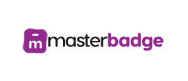
Main LOGO
The main logo should be used only on light backgrounds,
preferably on a white background.
preferably on a white background.

Secondary LOGO
Our secondary logo should be used only on dark backgrounds,
preferably on a black background.
preferably on a black background.
Full black

Full White
Gray
Rationale
The logo was developed to be modern and future-proof, updating masterbadge`s persona and realising the design with new techniques. It is a distinctive mark and a brand that seeks to present the masterbadge Brand as a forward-thinking, clean and solid organisation.
Construction
The “Badge” is constructed using 2 badges overlayed on top of each other, that together form a whole The typographic element is designed to complement and enhance the logo graphic. Existing in harmony, it neither dominates or becomes insignificant. The supporting typeface and collateral are clean and modern to reinforce our identity as a young and professional organisation.
Colour Treatment
There is one preferred full-colour option for landscape variations shown here. These logos should be used whenever possible.
We want to look good all the time
So take time to consider how to apply our logo.

01 Space around the logo
Always leave the logo some space to breathe. Try to use white or neutral backgrounds.

02 If you have to...
If it’s unavoidable to sit the logo on a dark colour, use the WHITE logo.

03 Vertical Option
Use this option specifically for where our main horizontal layout logo does not fit best.
We don’t want to come across all doom and gloom, but there is a right way and a wrong way to present our logo.

04 Not right
Do not rotate the logo.

05 Colour Clash
Do not place the logo on the wrong ( similar ) colours.

06 Not Good
Do not use the WHITE logo on backgrounds that are too light or cluttered.

07 No Thanks
Do not add embellishments like drop-shadows, embossings etc. to the logo.
01 Space around the logo
Always leave the logo some space to breathe. Try to use white or neutral backgrounds.
02 If you have to...
If it’s unavoidable to sit the logo on a dark colour, use the WHITE logo.
03 Vertical Option
Use this option specifically for where our main horizontal layout logo does not fit best.
We don’t want to come across all doom and gloom, but there is a right way and a wrong way to present our logo.
04 Not right
Do not rotate the logo.
05 Colour Clash
Do not place the logo on the wrong ( similar ) colours.
06 Not Good
Do not use the WHITE logo on backgrounds that are too light or cluttered
07 No Thanks
Do not add embellishments like drop-shadows, embossings etc. to the logo.